This article will guide you through customizing the Footer section on the Activity Landing Page (previously called the Event Page). If you are just starting to design your Activity Landing Page, you will likely want to start here.
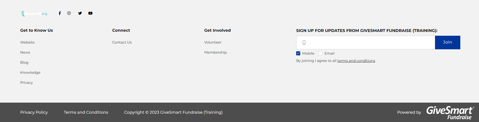
The Footer section of your Activity Landing Page is similar to any other professional website including action items for your supporters.

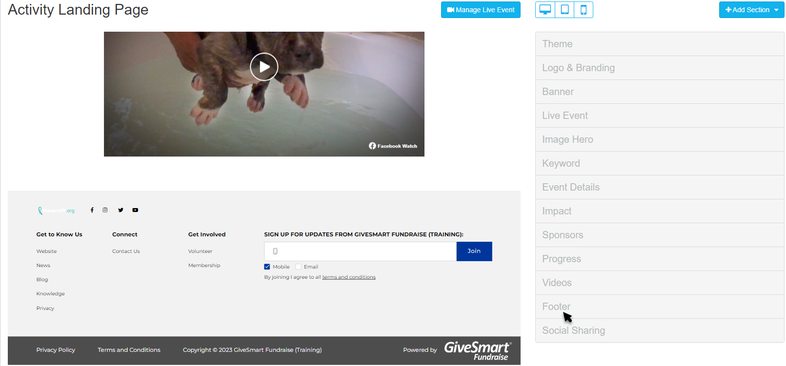
Select the Footer section from the Activity Landing Page Designer for customization.
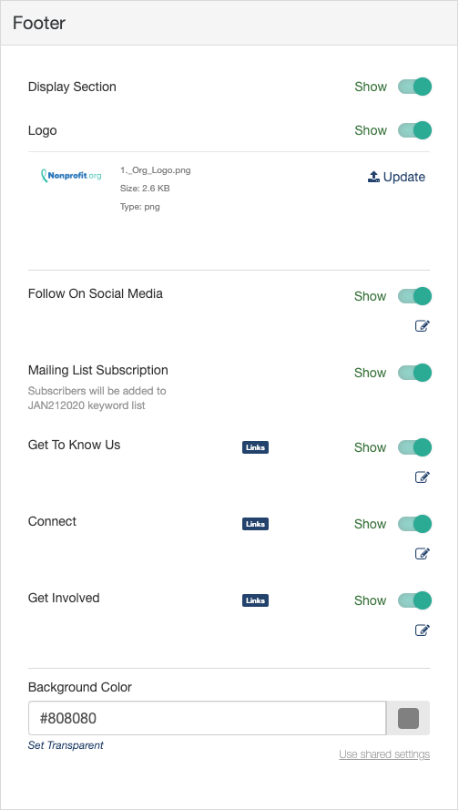
Display Section
If you decide to not use a Footer, you can hide the entire section with the Show/Hide switch.
Logo
The default logo that appears in the footer is the logo that is set in the Activity Landing Page's Logo & Branding section, but can be changed here by clicking Update.
Select an image from your system to upload.
Crop the image as needed and click Crop and Save or select Use Original.
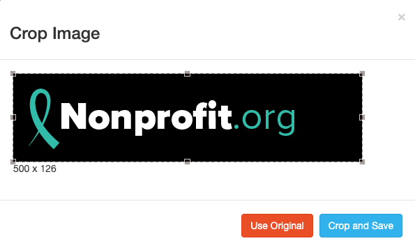
For best results, the Logo should be at least 150px by 150px. It doesn't need to be square, though. For more information on Image Sizes, click here.
If you don't want an image in the footer, you can hide it by clicking the Show/Hide switch.
Follow On Social Media
The Follow On Social Media in the Footer is separate from the Social Sharing section in the Activity Landing Page, as described here. Social Sharing refers to the social media icons that appear in the banner or float in the Hero section and are ways to share about the Event to friends and family.
The Follow On Social Media in the Footer, instead gives your supporters a way to connect with you on social media.
If you don't want social media in the footer, you can hide this element by clicking the Show/Hide switch.
If you want to change the settings, click the Edit icon.
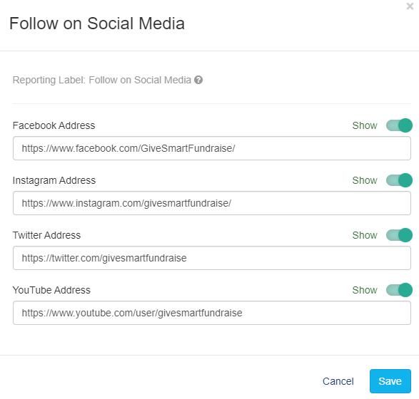
Show or Hide any of the Social Media options. If you don't have a presence on a platform, you can hide it.
Edit the addresses as needed. If you have a specific social media event page, playlist or account, consider sending guests directly to those links.
The default links are pre populated from the account's Shared Settings.
Make sure to click Save after making any changes.
Mailing List Subscription
By enabling the Mailing List Subscription feature, supporters can enter their Mobile number or Email to receive messages from you. This will create a list of supporters who want to hear from you about upcoming events and initiatives.
Subscribers will be added to the list under your activity keyword.
To hide this element, click the Show/Hide switch.
Get To Know Us / Connect / Get Involved
There are three columns for links: Get To Know Us, Connect, and Get Involved. Change the names, hide columns and add links to each column. This is where you can provide any number of links for your supporters to learn more about your organization and potentially do more than what you are presenting on your Activity Landing Page.
Hide any of the three elements with the Show/Hide switches. The remaining elements will move to fill the area.
Click the Edit icon to add or edit links.

The Display Label can be up to 12 characters long and will be the word(s) that name the column.
The Link defaults to a drop down menu where you can directly add the link to any other form within the campaign to your Activity Landing Page. You can start typing the name of your form to narrow your selection.
You can also click Use an external link instead to direct your supporters to something like your homepage. If you change your mind about using an external link, you can click Use a GiveSmart Fundraise link instead to revert to the original design.
To add more links, click Add new link. You can have a maximum of five links/entries in each column.
To reorder the links, click and drag the arrows icon of the item you wish to move and drop it into the correct position.
To delete a link, click the minus icon to the right of the line.
Make sure to Save the links when you're ready.
Background Color
The Background of the Footer section starts as lighter grey (hex code #808080) for the Dark Theme and very light grey (hex code #f2f2f2) for the Light Theme.
To change the Brand Color, enter a color's hexadecimal code or click on the color picker and select the color of your choice by using the color bar and dragging the circle around the color field. There are also default colors you can select or use as a starting point. Once you've selected a color on the color picker, click apply.

Disclaimer Links
The very bottom of the Footer shows the Privacy Policy, Terms and Conditions, the Copyright, and the powered by GiveSmart Fundraise logo.
The Privacy Policy populates with what is written in your Account Settings, as described here. If you do not have your own posted policy, it will link to the Privacy Policy of GiveSmart Fundraise.
The Terms and Conditions are the standard GiveSmart Fundraise Donor and Subscriber Terms that appear on any GiveSmart Fundraise form. You can see this page here.
The Copyright will use your Organization Name written in your Account Settings, as described here.
If you have been going down the list of your Activity Landing Page sections, then the design is done! You will want to check and tailor your Social Share settings, as outlined here. otherwise you are ready to start using your Activity Landing Page.
You can always edit, add and move other sections, as outlined here.
To double check that you've covered everything, check the Activity Landing Page Design article here.