This article will guide you through adding a Live Event section to your Activity Landing Page (previously called the Event Page). If you are just starting to design your Activity Landing Page, you will likely want to start here.
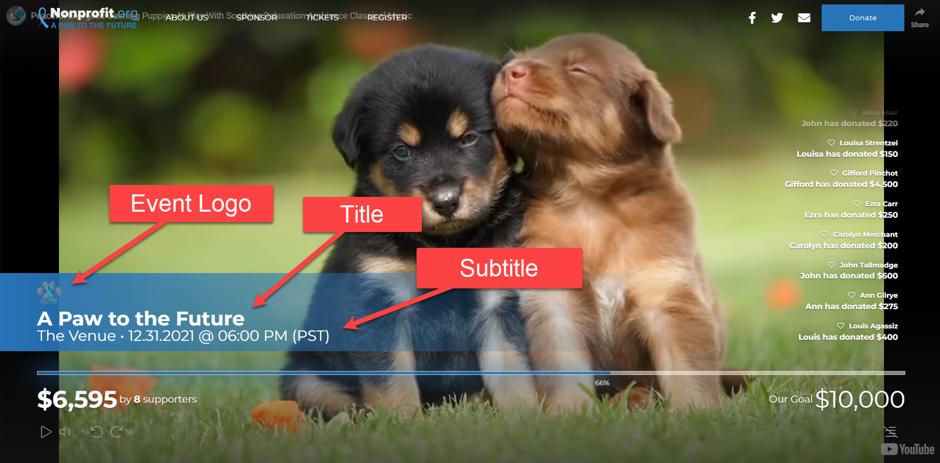
If your event will have a livestream or recorded video, you can display it prominently in its own "Hero" section. It will show at the top of the page, essentially replacing the normal Image Hero as the first visible section.
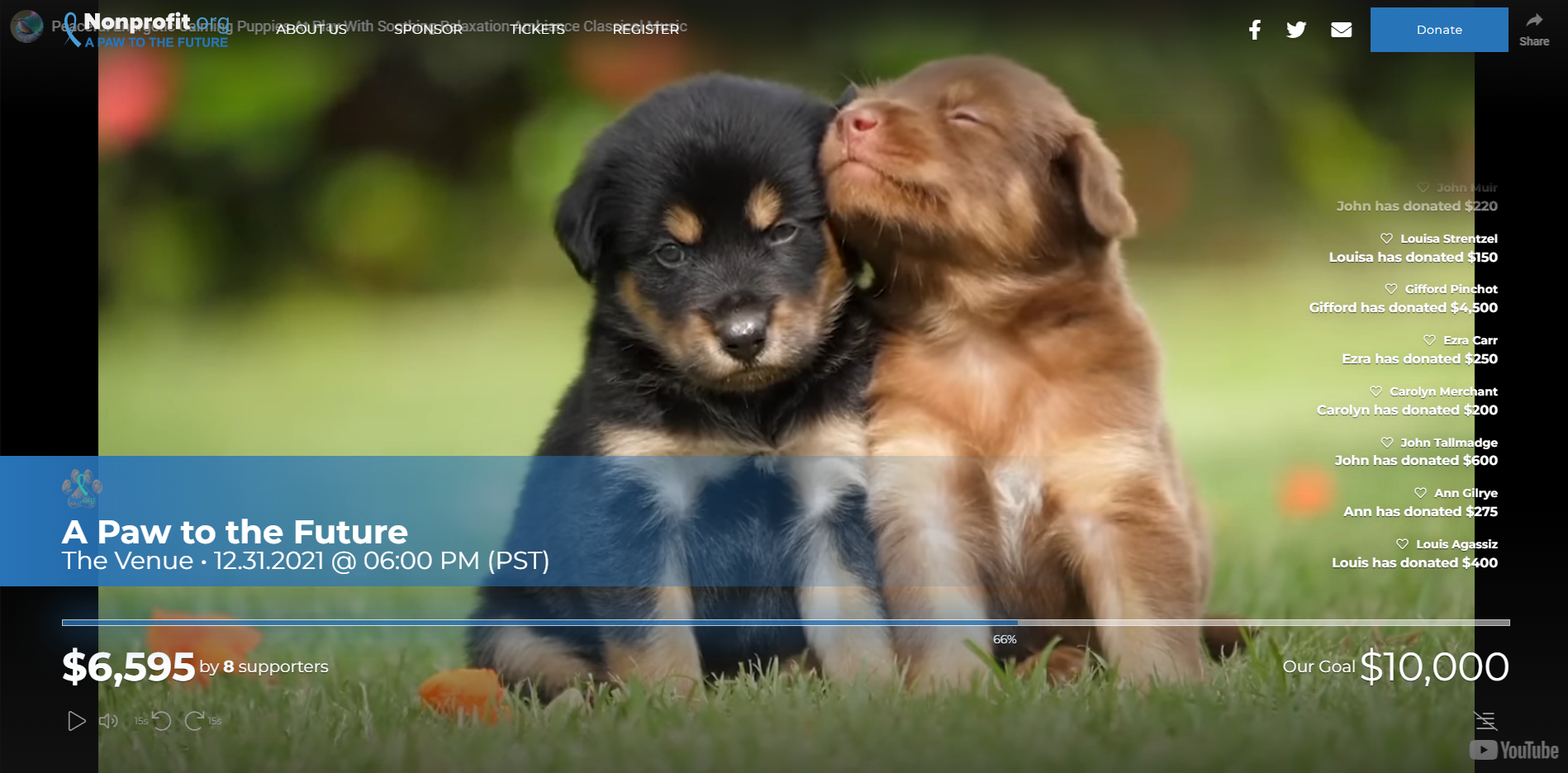
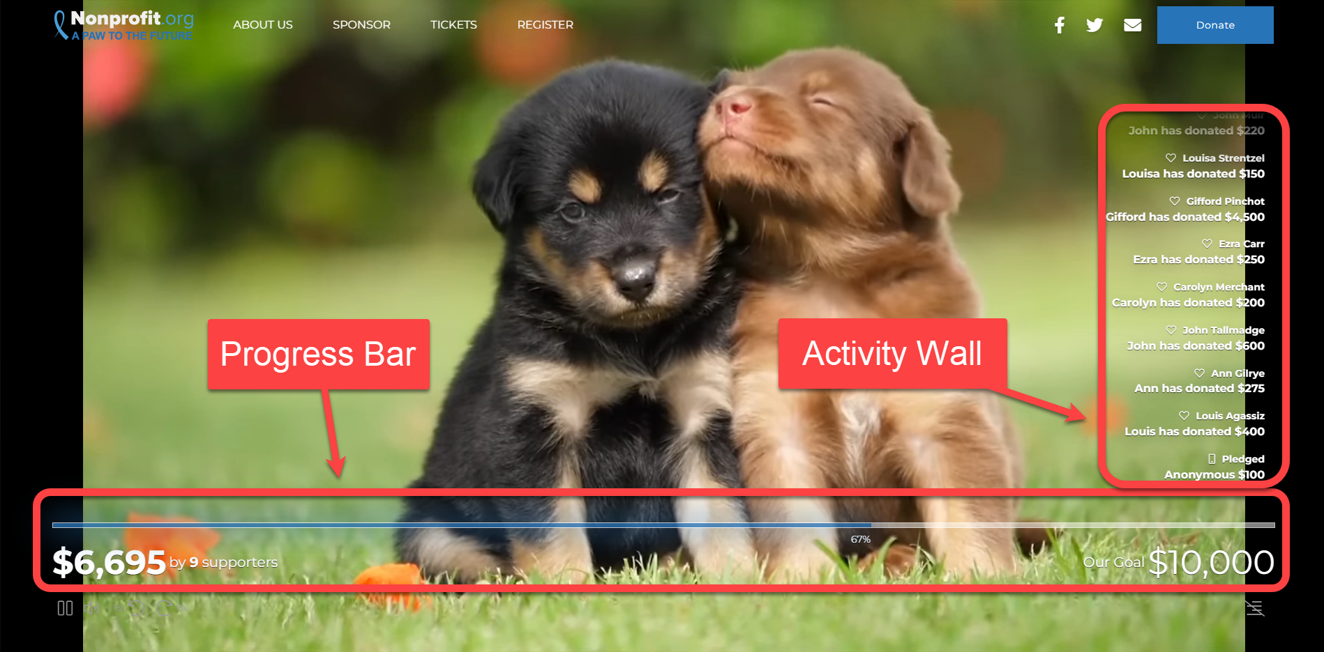
The Live Event section can include elements similar to a Progress section or Fundraising Thermometer page. You can display the amount raised, your goal and a donor wall.
The progress bar toward your goal is displayed across the bottom of the video. The Donate button is always visible in the banner at the top, making it easy for viewers to participate in your fundraising. The Activity Wall shows donations and pledges as they are added.
When the page first loads, a banner will be seen across the video with the campaign name and details. This banner will disappear after a few seconds so more of the video is visible. This same banner will reappear when the video is paused.
Designing the Live Event section
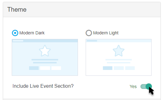
To use the Live Event section, first go to the Theme section under the Activity Landing Page designer. There you will see the opportunity to include the Live Event section.
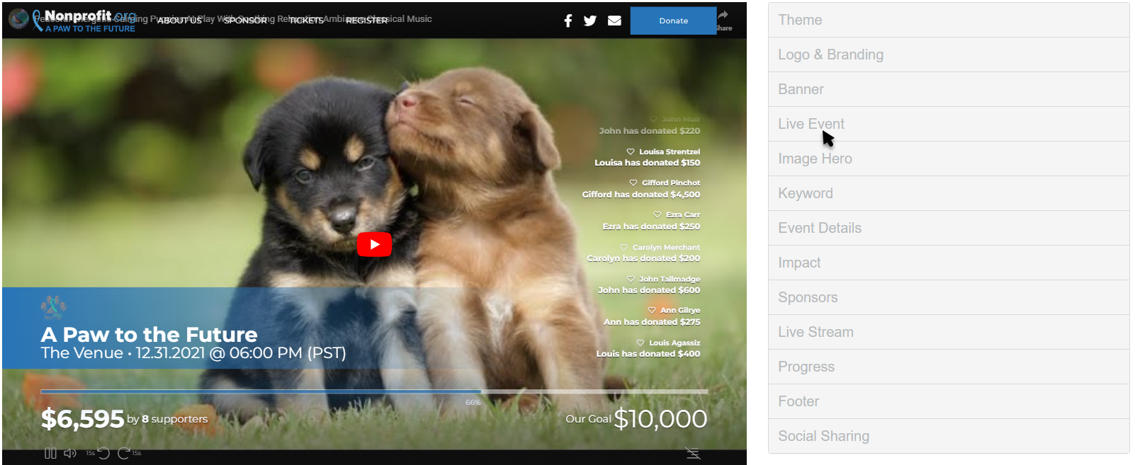
The Live Event section will then populate in the Activity Landing Page designer.
Display Section
If you decide to not use the Live Event section, you can hide the entire section with the Show/Hide switch.
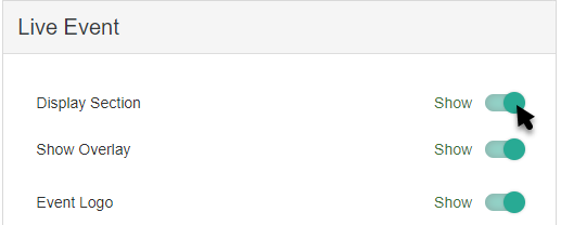
Show Overlay
By default, the Overlay will darken the edges of the video to allow your Progress Bar and Activity Wall to stand out. You can remove the Overlay with the Show/Hide switch.
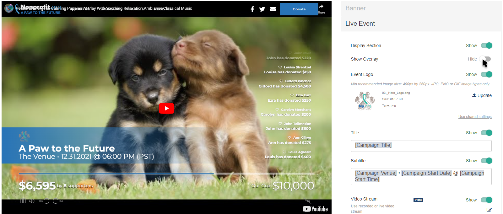
Event Logo
The Event Logo for the Live Event section pulls the logo selected in the Logo & Branding section. The Event Logo is placed in the banner that appears when the page first loads and when the video is paused.
If you would prefer to have a different logo, such as a unique one for your event, you can change the logo by clicking Update.
Select an image from your system to upload.
Crop the image as needed and click Crop and Save or select Use Original.
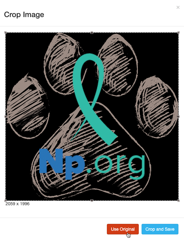
For best results, the Logo should be at least 150px by 150px. It doesn't need to be square, though. For more information on Image Sizes, click here.
If you don't want an Event Logo image in the Live Event section, you can hide it by clicking the Show/Hide switch.
Title
Like the Event Logo and the Subtitle, the Title appears in the banner when the page first loads and when the video is paused.
By default, the Title will be the special variable [Campaign Title]. This title pulls from the Campaign Details. You can edit the Title to be anything you wish and include different formatting by changing it here in the Live Event section. Variables can also be chosen from the drop down list.

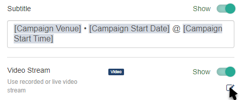
Subtitle
Like the Event Logo and the Title, the Subtitle appears in the banner when the page first loads and when the video is paused.
The Subtitle is very similar to the Title. It displays below the Title and by default includes the variables [Campaign Venue] [Campaign Start Date] @ [Campaign Start Time], based on the Campaign Details as described here.
You can edit the Subtitle to be anything you wish and include different formatting, in the same way as the Title. You can also choose other variables from the drop down list.
Video Stream
To turn off the Video Stream use the Show/Hide switch.
Click on the Edit button to add a video to stream. This can be a livestream or previously recorded video from YouTube, Vimeo or Facebook.
Copy and Paste the link from the source (YouTube, Vimeo or Facebook).

Click Save.
During a live video, your supporters can select play or pause. If it is paused, when they select play again, it will jump to the actual live video.
If you are using a recorded video, your supporters can play/pause and also fast forward or rewind in 15 second increments.
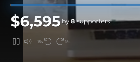
Progress Bar
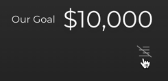
The Progress Bar appears across the bottom of the video totaling the amount collected and pledged in the lower left with the fundraising goal in the lower right. The bar fills the width of the page and acts as a thermometer showing the percent collected toward the goal.
You can turn off the Progress Bar with the Show/Hide switch.
Click the Edit icon to make changes.

Here, you can Show or Hide the Goal, the Total Donations and the Donor Count by turning each on or off.
You can also set your Goal here.
Make sure to click Save after making any changes.
Activity Wall
The Activity Wall appears up the right side of the video. It can be hidden directly on the Activity Landing Page using the the icon in the lower right immediately below the Goal.
You can also hide the Activity Wall within the Live Event section on the Activity Landing Page designer.
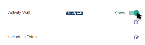
To change what appears on the Activity Wall click the Edit icon.

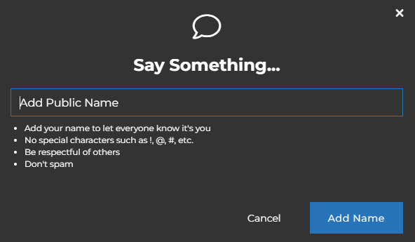
Use the Show/Hide buttons to control what activities you wish to appear on the wall. You can show Donations and/or Comments. The Comments section will allow anyone to make a comment and communicate with other viewers as they watch your live stream.
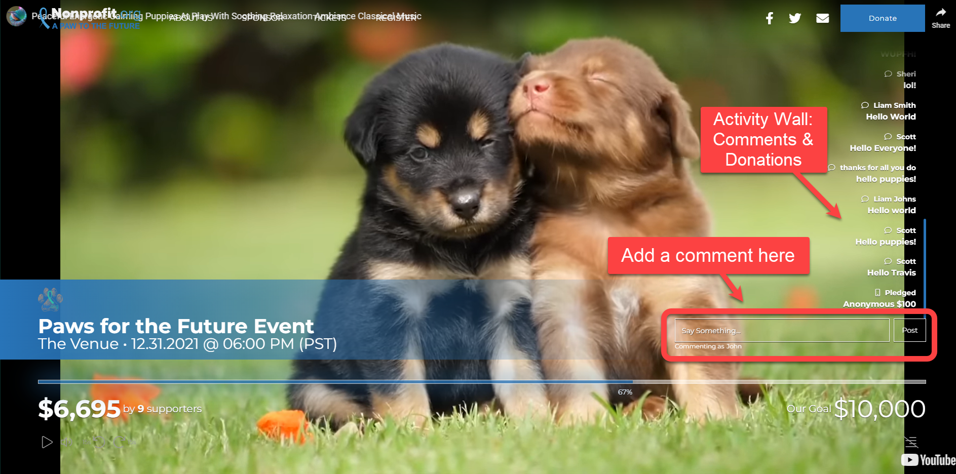
When a viewer click the Say Something box they are asked to provide their name before they are able to type in their message.
The Donations can be customized to include the Donor Name and/or Donation Amounts using the Show/Hide switches.
Make sure to click Save after making any changes.
Include in Totals
Like a Fundraising Thermometer, the Live Event section is designed to be presentable for a live event, in this case something livestreamed. This means that you are expecting your supporters to be viewing the Activity Landing Page live and so they will want to see immediate responses to their texts to pledge and donate.
So, like the Fundraising Thermometer, by default, the Activity Wall will include collected donations, pledges. pending donations and offline donations. You can change this in the Include in Totals section by clicking the Edit icon.

Click Save to save any changes you make.
Background Color
The Background Color in the Live Event section edits the color seen behind the Activity Wall when viewed on a mobile device. It starts as dark grey (hex code #333333) for the Dark Theme and white (hex code #ffffff) with the Light Theme.

To change the Background Color, enter a color's hexadecimal code or click on the color picker to select the color of your choice. Use the color bar and circle to select. There are default colors you can use as a starting point. Once you've selected a color on the color picker, click apply.
