This article will guide you through editing the Sponsors section on the Activity Landing Page (previously called the Event Page). If you are just starting to design your Activity Landing Page, you will likely want to start here.
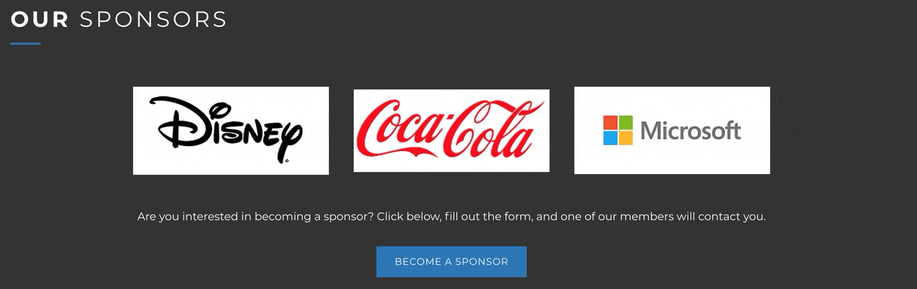
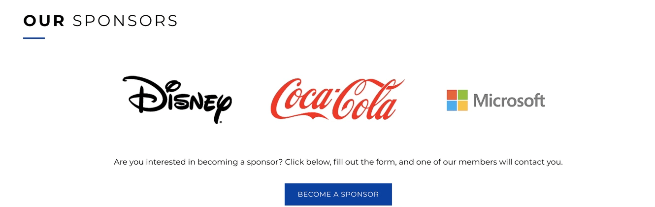
Showcase corporate sponsorships on your Activity Landing Page. Logos can be added and even linked to a sponsor's website. Include an action button for others to also become sponsors.

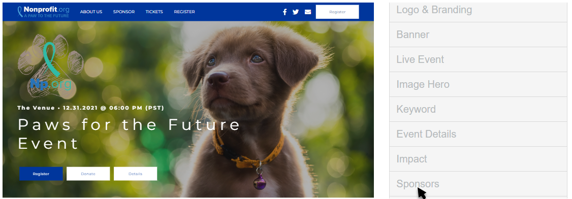
To edit your Sponsor section, navigate to the Activity Landing Page designer and click Sponsors.
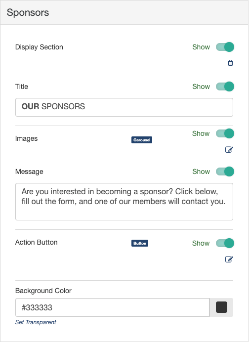
Display Section
If you decide to not use Sponsors, you can hide the entire section with the Show/Hide switch.
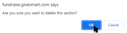
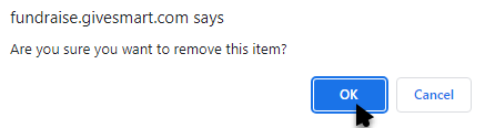
You can also delete the section by clicking the Trashcan icon, if you don't ever plan to use it. If you delete it, you will be shown a confirmation box before it completes the deletion.
Title
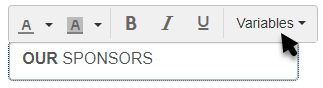
Edit the Title to be anything you wish. You can also choose other variables from the drop down list. By default, it says "OUR SPONSORS."
Images
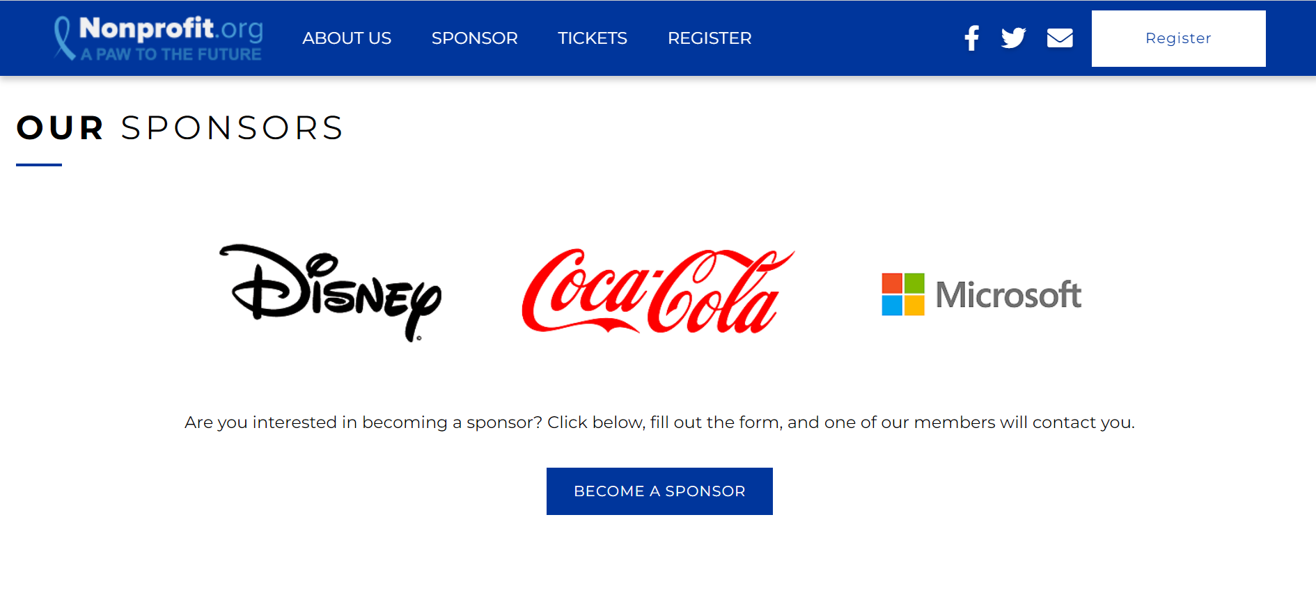
Include Sponsor Logos or Images on your Activity Landing Page. While it may be listed as a carousel type, and functions similarly to other carousels, the Sponsor Images do not rotate. Instead, they will show up to four images across the Activity Landing Page and continue down in neat rows, so all your sponsors will always be visible.
Click on the Edit icon to add or edit images for your Sponsor section.
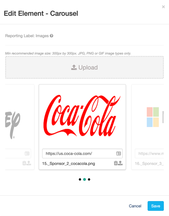
Click Upload to add images.
Normally in a Media Carousel, you can add a title. In the Sponsor section's Image carousel, you can include the link to the Sponsor's site. When supporters click on the Sponsor image, it will take them to the Sponsor site in a new window or tab.
Click in the text entry box and paste in the sponsor's URL.

With the link added, when someone hovers over the image on the Activity Landing Page, it will be clickable and the words Learn More will be added.
Click the Trashcan to remove an image from the carousel. You will get a warning before it deletes.
Click the Upload icon (the icon next to the Trashcan) to swap out an image.
When you have multiple images, you can click one image and drag it to change the order for the carousel.

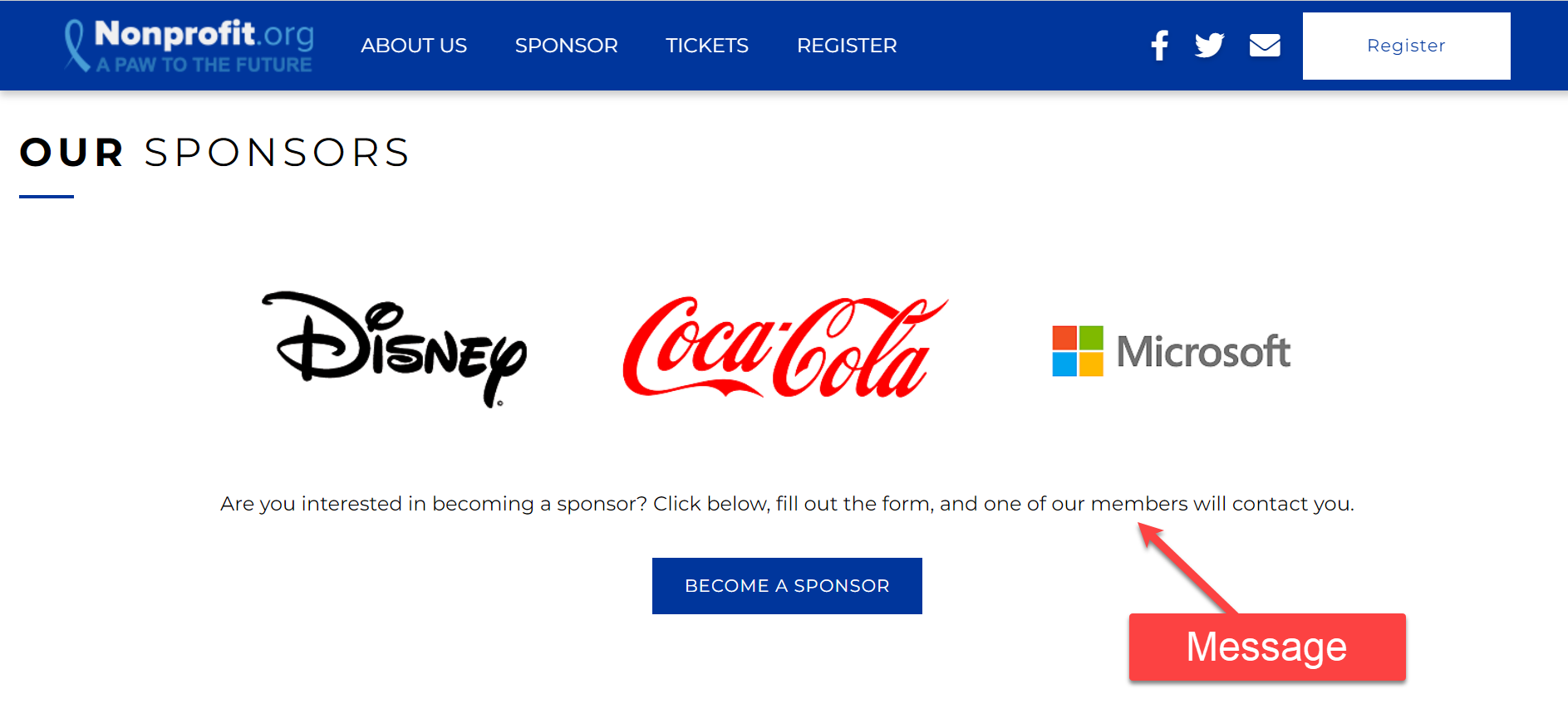
Message
The Message section is usually used to thank your sponsors and/or refer to the Action Button for others to become sponsors. It is a text box that includes the Rich Text Editor to change the color and style of the text as well as include various event details.
If you do not want to include a message, use the Show/Hide switch to remove it.

Action Button
The action button can link to any form within the Campaign or URL, however in the Sponsor section, it is primarily used for potential sponsors to complete a Corporate Sponsorship form. Use this as an opportunity to invite them to be included in the Sponsor section.
If you do not want to include the Action Button, you can use the Show/Hide switch to remove it.
Click the Edit icon to change the label on the button and choose the desired destination.

Display Label
The Display Label is what appears on the Button. By default, the Button will say BECOME A SPONSOR, but can be changed to anything you like, up to 20 characters.
Link
The Link defaults to a drop down menu where you can directly add the link to any other form within the campaign. Start typing the name of your form to narrow your selection.
You can also click Use an external link instead to direct your supporters to another URL page. If you change your mind about using an external link, you can click Use a GiveSmart Fundraise link instead to revert to the original design.
Make sure to Save the Button settings after edits are made.
Background Color
The Background of the Sponsors section starts as dark grey (hex code #333333) for the Dark Theme and white (hex code #ffffff) with the Light Theme.
To change the Background Color, enter a color's hexadecimal code or click on the color picker to select the color of your choice. Use the color bar and circle to select. There are default colors you can use as a starting point. Once you've selected a color on the color picker, click apply.

Now you can show off your supporters and invite others to sponsor as well.
If you are going down the list of sections in designing your Activity Landing Page, you are near the end. Review what is left to do here.