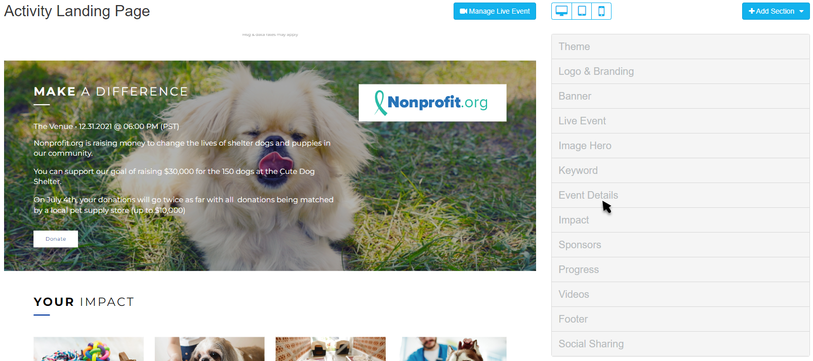
This article will guide you through editing the Event Details section on the Activity Landing Page (previously called the Event Page). If you are just starting to design your Activity Landing Page, you will likely want to start here.
The Hero section grabs the attention of the viewer with one or more large images; the Event Details section provides room to describe your event and get your supporters excited for it. The design of the Event Details section is similar to the Hero section, with the addition of a Message section to provide more text.

Edit the Event Details section within the Activity Landing Page designer.
Display Section
If you decide against using an Event Details section, you can hide the entire section with the Show/Hide switch.
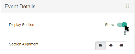
You can also delete the section by clicking the Trashcan icon, if you don't ever plan to use it. If you delete it, you will be shown a confirmation box before it completes the deletion
Section Alignment
Click the Left, Center, Right icons to alter the alignment of the text and logo of the Event Details section.
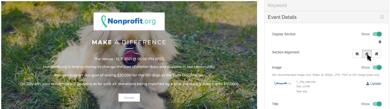
Image
The image in the Event Details section is more of a logo. This is a prime location to use your main organization logo.
By default, the Event Details Image is copied from the logo selected in the Logo & Branding section. If you would prefer to have a different image, you can change the image by clicking Update.
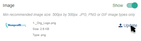
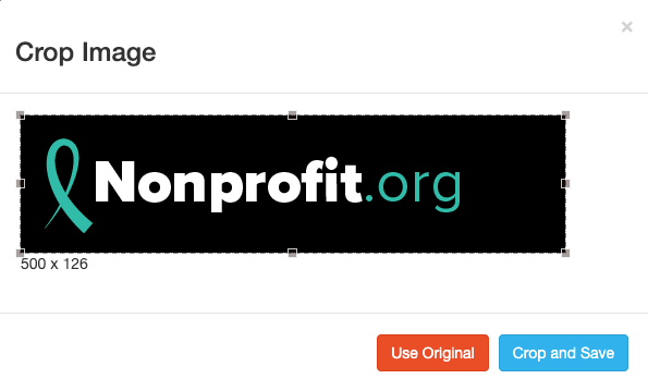
Select an image from your system to upload.
Crop the image as needed and click Crop and Save or select Use Original.
Title, Subtitle & Message
The Event Details section has a Title, Subtitle and Message where you can add in your details.
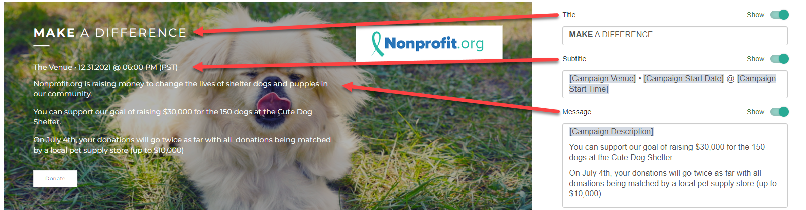
Title
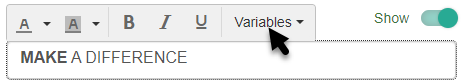
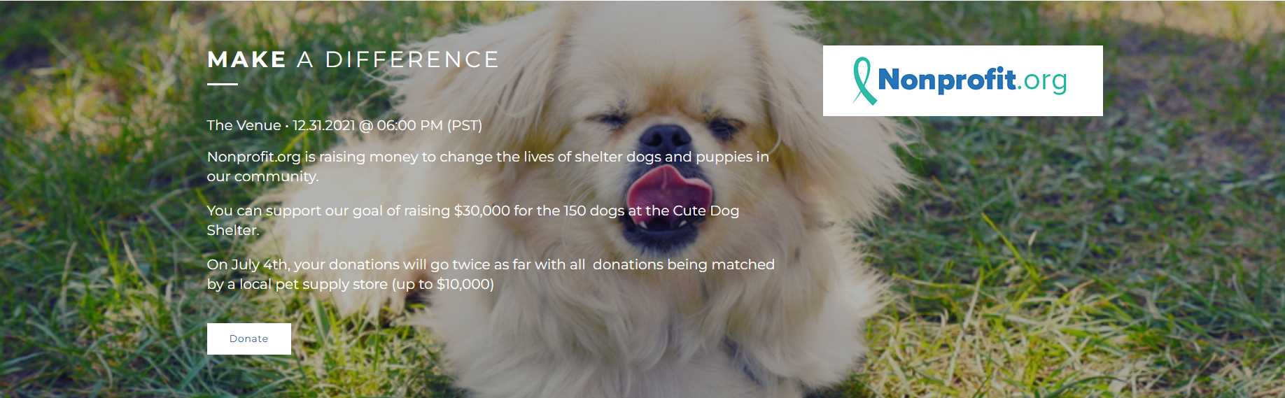
You can edit the Title to be anything you wish and include different formatting. You can also choose other variables from the drop down list. By default, it says "MAKE A DIFFERENCE."
Subtitle
The Subtitle appears below the Title and by default includes the variables of [Campaign Venue] [Campaign Start Date] @ [Campaign Start Time], based on the Campaign Details as described here.
You can edit the Subtitle to be anything you wish and include different formatting, in the same way as the Title. You can also choose other variables from the drop down list.
Message
The Message design is also very similar to the Title and Subtitle. It appears below the Subtitle and by default includes the variable [Campaign Description], based on the Campaign Details as described here.
You can edit the Message to be anything you wish and include different formatting, in the same way as the Title and Subtitle. You can also choose other variables from the drop down list.
This is where you can more fully describe your event and its details.
Action Button
Below the Message, include an Action Button. If an Action Button does not make sense for your section, use the Show/Hide toggle to hide the button.
Click on the Edit icon to rename the button and link it to your desired form or URL.
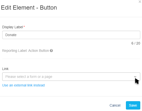
Display Label
The Display Label will be what appears on the button. You have up to 20 characters for the button text.
Link
Click the drop down arrow to select any form within the campaign as the destination for your button. Start typing the name of your form to narrow your selection.
Alternatively, click Use an external link instead to direct your supporters to an external URL or a link to another Activity Landing Page. If you change your mind about using an external link, click Use a GiveSmart Fundraise link instead to revert to the original design.
Make sure to Save your selected settings.
Background
The Background of the Event Details section starts as a Solid Color. This can be changed to a different color or a Media Carousel.
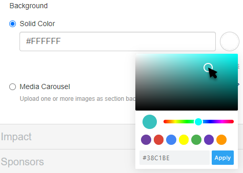
Solid Color
The Solid Color starts as dark grey (hex code #333333) for the Dark Theme. In the Light theme, the Solid Color is the brand color set in the Logo & Branding section. To change the Solid Color, enter a color's hexadecimal code or click on the color picker to select the color of your choice. Use the color bar and circle to select. There are default colors you can use as a starting point. Once you've selected a color on the color picker, click apply.
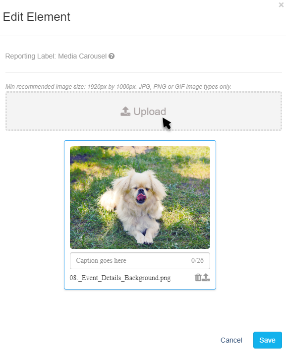
Media Carousel
Instead of a Solid Color, you can use one or more images to appear in the background.
Click the Edit icon to add or edit images for your Event Details section.
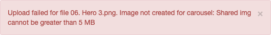
Click Upload to add images.
Click the Trashcan to remove an image from the carousel. You will get a warning before it deletes.
Click the Upload icon (the icon next to the Trashcan with the up arrow) to swap out an image.
If you have multiple images, click one image and drag it to change the order for the carousel.

With your Event Details section complete, your Activity Landing Page is half way done. Check the Activity Landing Page Design article for next steps.