This article will guide you through designing the Impact section on the Activity Landing Page. If you are just starting to design your Activity Landing Page, you will likely want to start here.
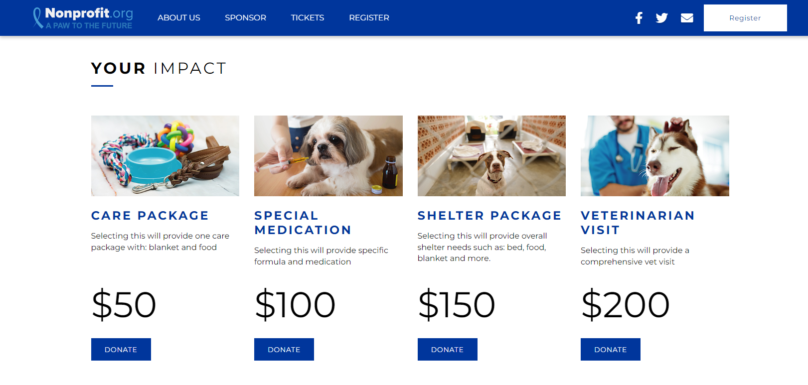
The Impact section is uniquely designed to highlight opportunities to give. Each of the four donation buttons can include a title and description. Personalize the experience by linking the button to your donation form with the exact amount pre-selected. Reference the article on Query Strings for directions on linking the form.
Impact Section
Click on the Impact section within the Activity Landing Page configuration.
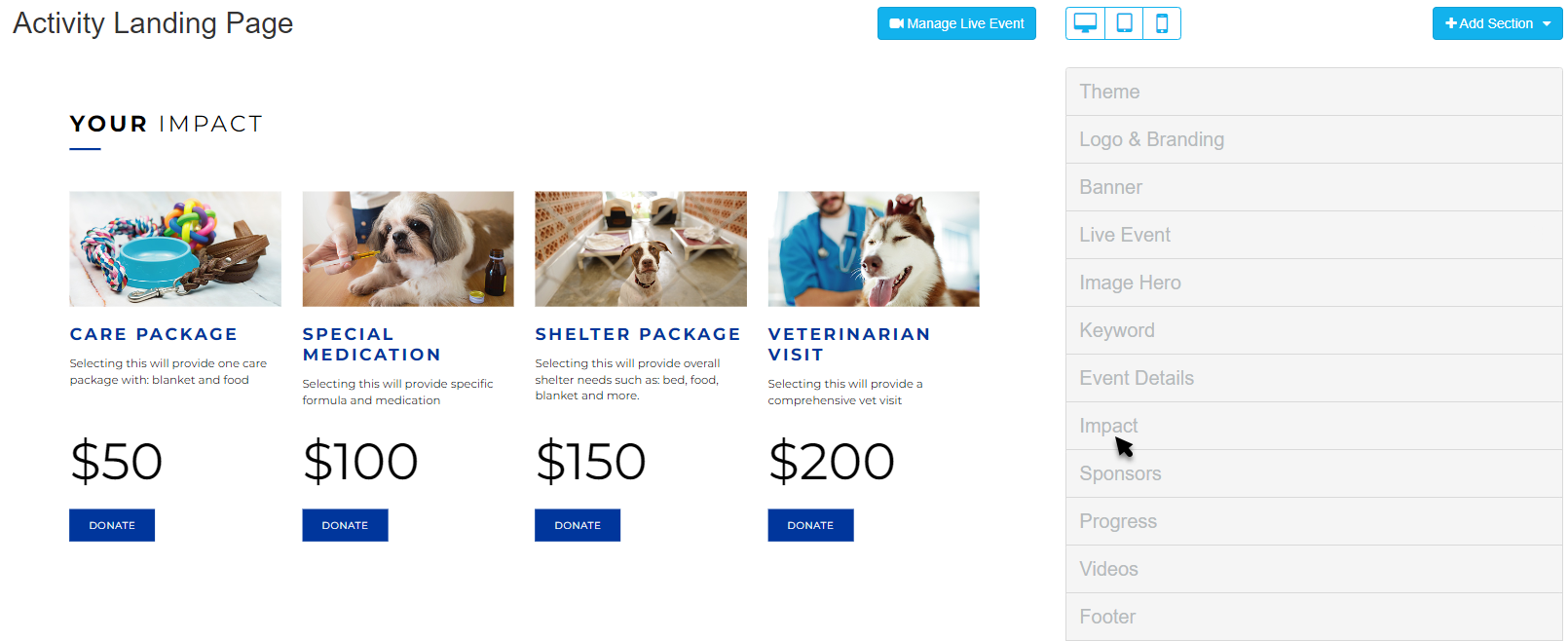
This will expand the section to show all of the elements within you can edit.
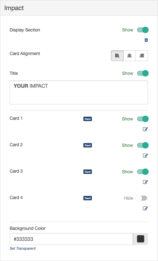
Display Section
If you decide against using the Impact section, you can hide the entire section with the Show/Hide switch.
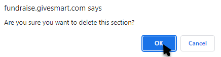
You can also delete the section by clicking the Trashcan icon, if you don't ever plan to use it. If you delete it, you will be shown a confirmation box before it completes the deletion
Card Alignment
Click the Left, Center, Right icons to alter the alignment of the text and buttons of the Cards in the Impact section.
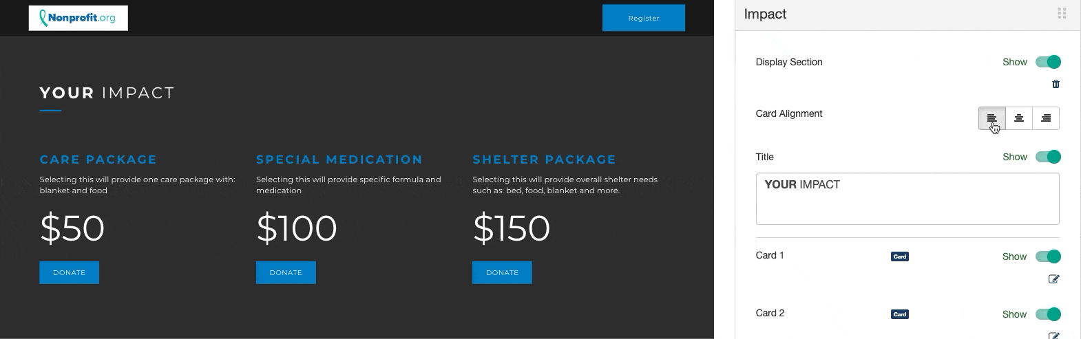
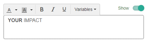
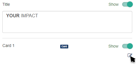
Title
Click within the Title box to edit the Title and include different formatting. Choose other variables from the drop down list, if desired. By default, it says "YOUR IMPACT."
Impact Cards
You can have up to four "cards" which include an image, title, amount, message and link.
Show/Hide cards using the Show/Hide switch.
Click the Edit icon to modify each card.
Adjust the Image, Title, Amount, Message, and Action Button Links.
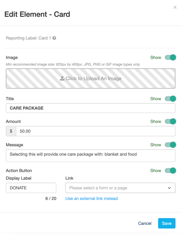
Impact Card - Image
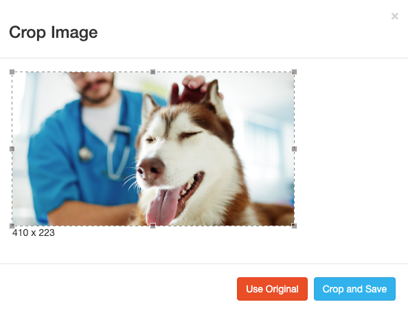
Select an image from your system to upload for your card. The recommended minimum size should be 625px by 400px.
Crop the image as needed and click Crop and Save or select Use Original.
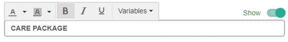
Impact Card - Title
Title your card so viewers know what the donation is supporting. By default, the title will be in the Brand Color. The color and format of the title can be changed by clicking inside the Title box.
Impact Card - Amount
The amount will show in large font above the button with a dollar sign ($) before it. It does not connect to the action button; it is just a displayed amount.
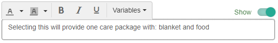
Impact Card - Message
Share how this dollar amount will impact your mission. Use this section to elaborate on your photo and title. Edit the font color and text by clicking inside the Message box.
Impact Card - Action Button
The action button is designed to drive your supporters to one or more of your forms. Frequently, this is linked to a donation form with the exact amount pre-selected using Query String Parameters. Alternatively, you could direct supporters to different donation forms behind each button.
To set up specific amounts with Query String Parameters, click the "Use an external link instead" option.
Query String Parameters
Since the action buttons likely just need a donation amount added, the simple process is to include the amount at the end of the URL.
- Choose Use an external link instead for the link.
- Copy the link from the donation form you wish to use
- Example: https://fundraise.givesmart.com/form/RRRbiA
- At the end of the link add: ?init[amount]=200
- Replace the number 200 with your desired donation amount
Your final link would look like this: https://fundralse.givesmart.com/form/RRRbiA?init[amount]=200
For more information about Query String Parameters, review the dedicated article here.
Background Color
The Background of the Impact section starts as dark grey (hex code #333333) for the Dark Theme and white (hex code #ffffff) with the Light Theme.
To change the Background Color, enter a color's hexadecimal code or click on the color picker to select the color of your choice. Use the color bar and circle to select. There are default colors you can use as a starting point. Once you've selected a color on the color picker, click apply.

With your Impact section complete, your supporters can now donate directly to your initiatives from your Activity Landing Page.
Check the Activity Landing Page Design article for the next steps in creating your Activity Landing Page.